

Coming Back to the Body
One of the first things you notice about a product is its colour. Long before you read the ingredients or understand what it does, you have already formed an impression.

One of the first things you notice about a product is its colour. Long before you read the ingredients or understand what it does, you have already formed an impression.
Having spent twenty years working in retail strategy and design, I find that moment fascinating. A colour can make something feel familiar, intriguing or reassuring. It can encourage you to pick something up, and influence whether you feel it belongs in your life.
When we developed YCODE’s visual identity, I wanted those decisions to have a foundation we could keep returning to.
We were creating products to be used on skin, with an ambition to help people feel their best. Human anatomy felt like a meaningful place to begin. It connected the appearance of the brand to the body we were developing for, and gave us a reference that would remain relevant as we grew.
That thinking found its way into the palette. Blood inspired our red. Bone gave us the off-white.
I liked the directness of those references. They bring our attention beneath the surface, to the body itself. Even the quieter off-white carries a connection to anatomy. Together, the colours remind us that every product we develop will become part of someone’s experience of looking after themselves.
Alongside them sits microalgae green, representing our From Sea to Cell formulation philosophy.
In the previous two articles, I wrote about the sea and the exploration of algae that followed. That journey opened up a world of biological possibilities, including the Chlorella microalgae we use in our Hydrating Face Serum and Mattifying Moisturiser.
The green brings that exploration into the identity. Beside the anatomical references, it connects the ingredients we investigate with the body they are ultimately intended to support.
For me, this gives the palette a purpose that continues long after the first impression. It is a constant reminder to ask who we are developing for, what their skin needs, and how we want them to feel.
Those questions matter because it is easy to become absorbed in individual decisions. You can spend hours considering a shade, a material, a texture or an ingredient. Each deserves attention, but eventually you have to step back and consider how they work together for the person holding the finished product.
Will they understand what it does? Will they enjoy using it? Will it fit into their day?
My design background has taught me to think about that experience as a whole. A product might first catch someone’s attention in a photograph or on a shelf, but it will spend much more of its life beside a bathroom sink.
Someone will reach for it when they are half awake, getting ready for work or winding down at the end of the day. The way it feels in their hand, how it dispenses and how quickly the formula absorbs all become part of their relationship with it.
That is where the identity meets the formulations.
We developed YCODE around men’s skin and the concerns men wanted help with, including dehydration, excess shine, uneven-looking texture and visible tiredness. We also considered what makes a routine easy to keep.
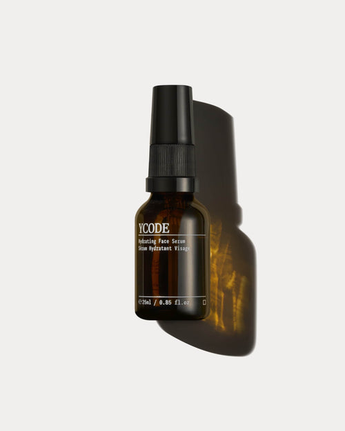
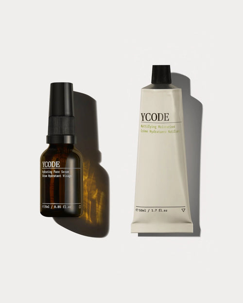
Our Hydrating Face Serum is the first step after cleansing. Chlorella microalgae extract sits alongside niacinamide, hyaluronic acid, prebiotics and a biomimetic peptide in a lightweight formula designed to support hydration, the skin barrier and the appearance of tone and texture. It absorbs quickly, ready for moisturiser.
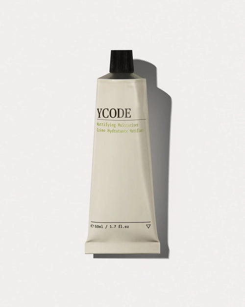
The Mattifying Moisturiser follows, providing hydration while helping reduce unwanted shine. Its finish matters because someone can want their skin to feel comfortable and cared for while preferring a naturally matte appearance.
The Advanced Eye Serum comes last. It has a targeted role around the eyes, addressing the appearance of dark circles, puffiness and fine lines, with natural-looking correction.
Each formula has its own purpose. The care taken over their textures and finishes helps those steps become a familiar sequence, morning and evening.
I see the packaging as part of that same experience. You encounter it every day. It becomes a small, familiar presence in a space where you begin and end your routine. I think that deserves care, and a connection to the purpose of what is inside.
Ultimately, helping people feel their best is a personal ambition. It will mean different things to different people. Feeling more comfortable in their skin. Looking fresher before a meeting. Taking a little more care of themselves as they get older.
At the sink, those ambitions become practical. A few moments of attention, products that feel good to use, and a routine that fits into daily life.
That is what our colours keep bringing me back to. Blood and bone remind us of the body. Microalgae green reminds us of the exploration behind our formulations. Together, they keep our ingredients, design and daily care connected to the person we are doing all this for.
Hydrating Face Serum · Mattifying Moisturiser · Advanced Eye Serum

I started YCODE because most skincare was never designed for men’s skin. What I write here is what the formulators taught me, and what the trials actually found.
Continue reading
VIEW ALL →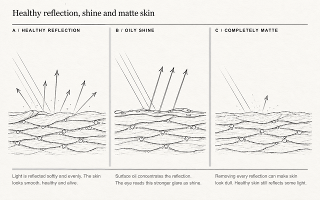
Healthy-looking skin is shaped by hydration, surface texture, oil, tone and the eye area....
Tiredness is not one line, shadow or colour. It is a pattern the eye...

When you stand beside the sea, it is usually the scale that gets your...


